GradskillsPro
The 5 must-have elements that make your paper stand out
~ How to write a paper using the IDEAS framework – post 4 of 6 ~
Posted on MM/DD/YYYY
Click here for part 1 / 2 / 3 / 4 / 5 / 6
Download your guide on how to create publication-quality figures for your manuscript
When most people ask “How to write a paper”, THIS is really what they’re talking about. How do you create a story line? How do you make your figures? How do you organize things? How do you make sure your paper doesn’t become a random collection of thoughts? How do you make your paper stand out? And how do you avoid endless iterations with your co-authors? This post tells you how. Let’s get into it.

If you’d rather watch the video on Youtube, click HERE.
What is the IDEAS framework?
We’re going to use the IDEAS framework which stands for:
I – Imagine
D – Draft and Document
E – Establish and Express
A – Adjust
S – Submit
and this post covers the ESTABLISH & EXPRESS part where we think about important factors related to our paper before we start writing, thereby eliminating writer’s block.
I've been using this framework for the last 17 years to write and publish my own papers and I've taught many grad students, undergraduates and postdocs how to write and publish their papers, too. All without the stress, writer’s block, endless iterations, or numerous rejections.
Must-have #1: Use your data to create a story line
How do you create a storyline from the pieces of data that you have? And what's the best strategy for this? What I've found is to pick the most important or most interesting pieces of data. Pick about 3 - 6 pieces of data, depending on how long of a story you want to make it, and also depending on what are the most important pieces of data that you want to show. This depends also a little bit on the journal, the article type, and the storyline that you want to tell. Everything else that is not crucial can go into the supplement.
So then look at your data and make sure that data is bullet proof. If you have a bunch of outliers that you cannot explain, dig into this, figure out why they happen. Don’t take out the outliers, but you need to be able to explain them! You want to make sure is that you only show data that you can explain and you don't actually ruin your reputation by publishing bad data.
Once you understand your data, sometimes what I do is I print out all figures and tables and lie them out on the floor and then pick the pieces that make up the storyline. And then you want to order your figures and tables into a storyline. really take those 3 - 6 pieces of data and order them so that they make the most sense in terms of telling a story.
Each main point of the paper should be highlighted in a figure and a section. When you order your figures or tables, typically what works really well is to show the most important figures or tables first. Because when the reader reads the paper, sometimes they might not get to figure five. But it also depends. sometimes if that doesn't make the story flow, then just keep it either in order of complexity or chronologically to tell a great story.
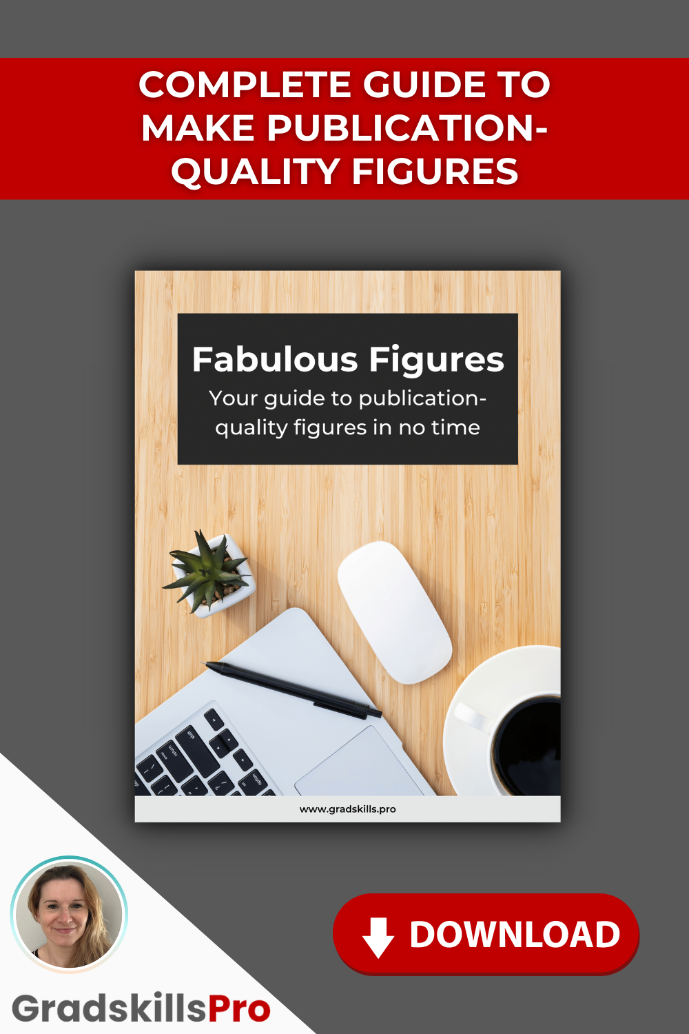
If you’d like the PDF guide on how to make publication-quality figures, click HERE to download.
Must-have #2: Create publication-quality figures
So when you have decided on the pieces of data you want to show, you need to make publication quality figures. I want to share some tips with you how to do that.
Decide on the color scheme before you make any figures
Because usually what happens if you don't think about this ahead of time, is that you make your first figure with three colors and your second with five colors, which are completely different. And then you have another figure, again with different colors, and basically your colors and color schemes are all over the place. They don’t correlate with the type of data that you want to show, which is really confusing to the reader.
If you decide on a color scheme early on and stick to the same color scheme for all of your figures, it's much easier for your reader to understand what the color scheme stands for.
For example: blue is always for a specific type of data that you're showing in each of your figures. Or red represents another type of data such as the baseline or something like that. This helps the reader to understand what you're trying to tell them.
Also, I highly recommend choosing gray scale figures if you can, because there are color figure charges that the journals charge. But also keep in mind that if you need color to tell a good story in the figure and if color if using color helps the figure, then keep color in the figure.
Try to avoid the red-green combination for colorblind people.
There are a lot of people who are colorblind and if you show them red and green, they cannot distinguish between the two. And you still want them to understand your figure.
Avoid stark contrasts unless it helps the figure
Sometimes this can be really jarring if you have black and white right next to each other in a figure. But if it does help the figure in some way, then keep it in there.
And then you want to ask yourself some questions like:
Are all axes labeled correctly?
Do you have any shadows that you can possibly avoid?
Really keep things simple and don't make it overly complex or fancy. Usually when you try to make it fancy, this is when your figure will start to look cluttered.
Keep the font sizes the same as much as possible
And if you have sub figures that you're assembling into a larger figure: when you resize the sub figures, make sure that all font sizes are still legible and that you don't have tiny fonts that you can't read anymore.
So when you have a figure that you have assembled from smaller figures, print it out on a piece of paper and see whether you can still read all of the font. If you cannot read it anymore, then that's a good indication that you have to increase your font sizes.
Avoid visual clutter
Ask yourself what can you take out of the figure? What are the most crucial pieces that you want to show and what pieces can you take out? And if you take specific pieces out, can the reader still understand the gist of the paper? If the answer is yes, then that piece of information is not crucial, and you can take it out.
An example of a visually cluttered figure is HERE. Maybe it’s somewhat amusing that this figure appears in a paper titled “An auditory-visual tradeoff in susceptibility to clutter”. ;)
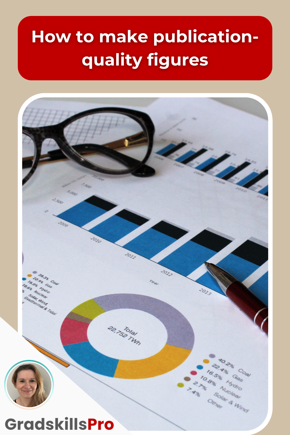
Click HERE to download your PDF guide on how to make publication-quality figures.
Must-have #3: Tell your story in the Results & Discussion section
So you have your three to six pieces of data. You have made them publication-quality. These are your figures or tables that you have already ordered into a storyline. Now you’re going to write your Results & Discussion section.
For this, create a subheading for each of the figures, which will then become its own section. What that does is: people who are really busy and who don't have time to read your whole paper, they can follow the storyline just by looking at the figures. On the other hand, the text corresponds to the figures and tells the same story. And after you created the subheadings that correspond to the figures, you will fill in the sections to follow along the storyline.
Must-have #4: Write a killer abstract
A lot of people are writing the abstract very much at the beginning when they start writing the paper. I highly recommend you NOT doing so and to write the abstract AFTER you've written Results and Discussion section, so basically after you've written most of your paper.
And the reason is the following: the abstract is the second biggest selling point of your paper after the title. And you need to understand that the abstract is not just a summary of the paper, but the abstract is there for to draw the reader in.
And it's also much easier to write the abstract and the conclusion at this point because you already know what the storyline is. You already know what the gist of the paper is. What are the most crucial, pieces of data that you want to highlight.
Write the abstract by following the rule of three
I write my abstracts by following the rule of three because the human brain can very easily hold three pieces of information.
So ask yourself: what are the three most crucial pieces of information that you want the reader to walk away with? And these points of information are what you're going to be talking about in your abstract.
Must-have #5: Write a compelling conclusion
I usually write the conclusion from the inside out, which is a method that I'm talking about in my Zero-To-Published-Program. The conclusion is answering the question: what specifically have you accomplished?
Describe the main findings, give an outlook of what still needs to be done, and connect it back to the big picture and the storyline of the paper. But also answer the question, how does the research that you're describing in that paper make the world a better place? How does this fit into the body of research that's already out there? This is how you connect things back to the big picture.

For more details and related videos about how to write a scientific paper, check out the Youtube video HERE.
Summary
In this post, you’ve learned how to use the IDEAS framework to write the most important parts of your paper, which includes the storyline, how to make publication-quality figures, how to write the Results and Discussion section, the Abstract and the Conclusion. I've taught many grad students and undergrads and postdocs over the years to write and publish their own papers using this framework. If you want me to teach you how to write and submit your paper in a lot more detail, you can join us in the Zero-To-Published-Program.
READ THIS NEXT: In the next article in this series, you’ll learn the step-by-step process on how to finalize your manuscript quickly.
Click here for part 1 / 2 / 3 / 4 / 5 / 6

Get weekly updates right into your inbox

Julia Koehler Leman, PhD
Computational biologist, Software Engineer, and Mentor
Passionate about teaching you about Scientific Communication


CATEGORIES
SOCIAL

SUBSCRIBE